News: Build Once - Deliver Everywhere.
How are people using the sites we build.
In this article we look at the statistics of over 100 websites the Story Group have built or manage providing some useful localised statistics for business.
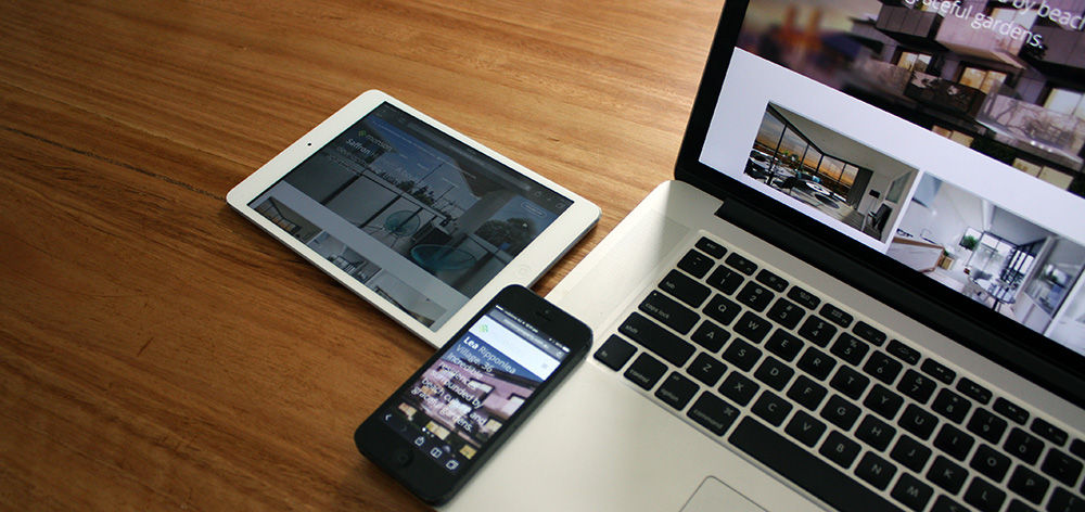
The purpose of this article is to demonstrate the rapid increase of both mobile and tablet devices to access web content and applications and why a "responsive" design is so important. Responsive Design is a term used when a site is built on a fluid grid which resizes and repurposes itself depending on the device that is accessing the site - so that it works across all devices.
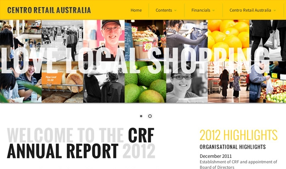
I can honestly say that I did not think that the uptake would be as rapid as it has been. Four years ago the statistics showed a small percentage of traffic was from mobile and tablet based devices. However, in 2012 we built two sites for the Centro Property Group. Both sites contained a lot of dry financial information - we made them both responsive and tracked the results. Even back then the mobile use of the sites ended up at around 15% - more than we expected.
What does this mean for your website?
Today, in 2015, our statistics show an average of between 25% to 45% of traffic is via a phone or tablet. Month on month the rate of "mobile usage" gradually increases.
Australia's love affair with the iPhone means that more and more people are using their phone to view a site. And the latest Android devices are increasingly popular. According to the latest statistics, Australia is 5th or 4th in the world for per capita ownership of smartphones and tablet devices.
Giving people a good experience on these devices is now becoming imperative to the success of a website.
The type of content people access when using a mobile or tablet device is often different. Contact sections, store locators, immediately actionable information is what people want on a mobile device.
Mobile commerce is something that is rapidly evolving as well. Click throughs from social media applications on the mobile device, Instagram for instance, are driving people to specific products on their mobile device. Being able to purchase immediately from the mobile device means a potential sale.
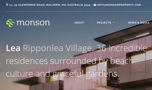
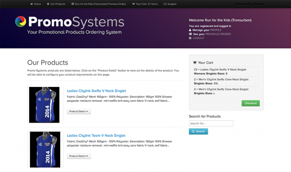
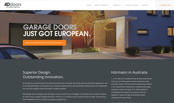
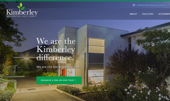
All of the sites we build now are what is called "RESPONSIVE" - we have many responsive examples in "our work" section of this website.
And finally, Google has just announced that “mobile-friendliness” will now be a ranking factor in the algorithm it uses to determine where a website ranks in its search results.
So if your website isn’t already optimised for mobile devices, then you should seriously consider it. It’s time to make the transition. Google clearly intends to reward mobile-friendly websites with better rankings in mobile search. Any websites that are not mobile-friendly may experience a decline in mobile rankings — and fewer consumers will find your site.
If you have a website that is not performing and needs to be made "mobile friendly" please get in contact with us - we'd love to help.
Build and Manage Once - Deliver Everywhere.
Story Group News
- Craft CMS and caching
- Craft CMS and Algolia Search
- Craft CMS and Cloudflare
- Craft CMS and Google Analytics
- Recovering your website
- Craft CMS plugins
- Securing Craft CMS
- We love Craft Commerce
- Why we choose to use Craft CMS!
- Responsive Emails
- Design = Conversion
- Maton Guitars
- We are all in this together
- Build Once - Deliver Everywhere.
- ExpressionEngine

