
News: Responsive Emails
Getting your email newsletter to display optimally on mobile devices is just as important as dektop
Internet enabled phones are a fantastic tool for a lot of applications. Unfortunately, reading your email often isn’t one of them.
A professional email can appear brilliant on your laptop but transfer it to the confines of a phone’s display and it can become virtually unreadable. The issues are many; tiny fonts, broken layout, columns that are too skinny and carefully crafted designs are that come up garbled and unsightly.
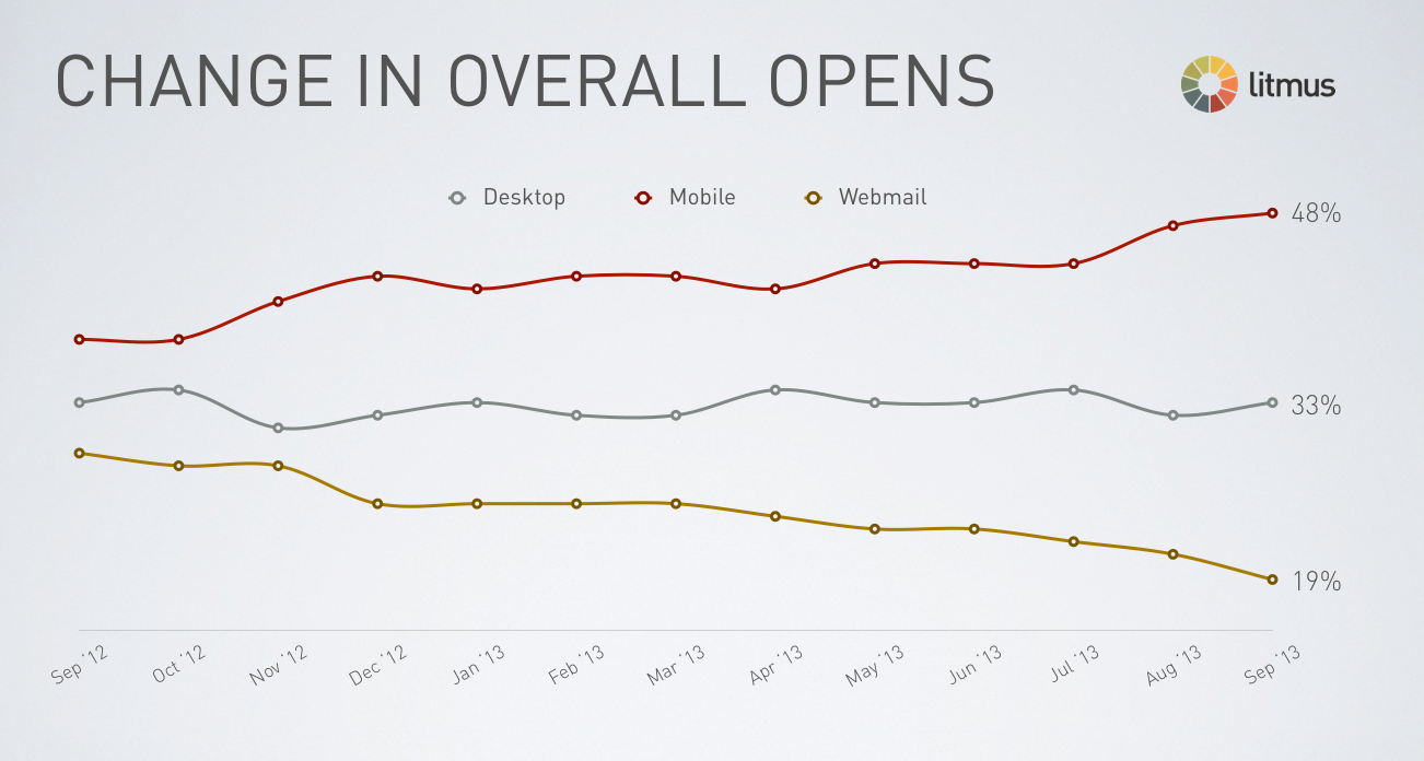
Image Source: https://litmus.com
The need to ensure compatibility with phone email applications is a growing concern for businesses. The number of people that access their email from a phone or tablet is rapidly growing. Between 2009 and 2014 the percentage of emails opened on these devices increased from an estimated 4% to 50%. In 2014 alone there was a 50% increase in mobile email consumption. In Australia between 80% to 90% of those "Mobile" email openings took place on an Apple iOS device, such as an iPhone or iPad.
This evolving trend in email user behavior has made it necessary for designers of email campaigns and newsletters to consciously work to display to best effect on mobile devices as well as traditional formats. Unless they are able to provide a user-friendly and aesthetically pleasing reader experience for small screen users, they are likely to suffer in terms of lower response rates and people unsubscribing from their service.
Migrating to a system and design that is compatible with mobile devices is a smart competitive move that will pay rich dividends down the track.
Readers will be more engaged, meaning that they are more likely to buy into whatever message you are selling. By taking the time to invest in an email design that is able to perform equally across a wide range of devices, you will be providing a seamless experience for your reader.
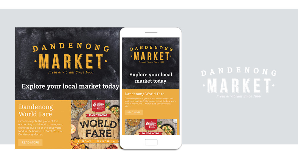
An excellent example of providing an email design that works equally well on both conventional and mobile devices is the new email campaign from the Dandenong Market. Open their email on your laptop and you’ll find a two column layout. Open the same email on your iPhone and it will display as a single column, making the email easier to work with. Click throughs work just as well on the mobile device as they do on a conventional email platform.
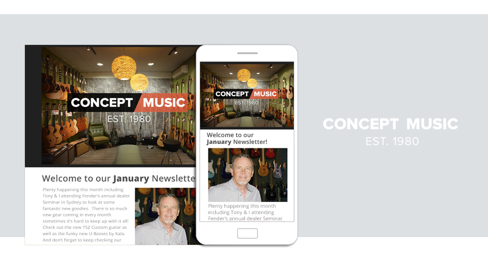
Another success story is Concept Music’s recent email campaigns. As a result of this responsive approach and accommodating mobile requirements, their click through rate has doubled and almost half of those opens have occurred on mobile devices.
Story Group News
- Craft CMS and caching
- Craft CMS and Algolia Search
- Craft CMS and Cloudflare
- Craft CMS and Google Analytics
- Recovering your website
- Craft CMS plugins
- Securing Craft CMS
- We love Craft Commerce
- Why we choose to use Craft CMS!
- Responsive Emails
- Design = Conversion
- Maton Guitars
- We are all in this together
- Build Once - Deliver Everywhere.
- ExpressionEngine
News & Article Archive
Some of our recent projects...
With over 100 projects completed in the last 2 years we work accross a range of industries and budgets.

")


